Nature as Architecture
By looking at the built environment you can make connections with the innate shapes of nature. This image shows how the forms of architecture and the ideas that have distinguished architecture as a whole throughout time, relate with the forms nature has created. The image above is how a spiral stair has very similar qualities to the inside of a shell.
Janine Benyus: Biomimicry in Action
This is a 20 minute clip I found on youtube about Biomimicry. It is a lecture that Janine Benyus gave on Biomimicry and how nature is already shaping the products and systems we use in design today.
Eastgate Building, Zimbabwe
Cologne Oval Office, Sauerbruch and Hutton
Color is an important part of designing in my opinion. You can take an existing building and make it much more experiential just by adding color to the facade of the interior spaces. I really like how the facade in the Cologne Oval Office Building and how the addition of color really make the building stand out from its existing surroundings. I used an idea similar to this in the design of a mixed use building in the Fenway area. I used a system of colored louvers throughout the facade that really spiced up the experiential quality of the street-scape.
Louvered Facade
Yale Center for British Art, Louis Khan
The Yale Center for British Art was a precedent that I studied for a project I did in my 3rd year when designing my library. I took a lot of the ideas from this building like the exposed structure and the contrast of concrete and wood. I really like how the exterior has such a harsh contrast from the interior. I also really like the juxtaposition of the materials and this precedent made me work really hard to successfully integrate the two together.
"Living" Architecture
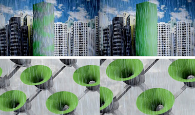
Incorporating nature into Architecture has always been a driving factor into all of my designs. I really like this futuristic design of how we can take natures strategies and use them to create a new kind of architecture. The picture above is an idea of an active skin and how it would work like a membrane. This skin also incorporated a human interaction by being able to open, close, breathe and adapt according to their environment. This proposal was done by Philips Design
Leaves - Photovoltaic Panels
This Image shows a breakdown on how a trees leaves have motivated us to create different functional technology. If we mimic nature we would create a better world where we have less of an impact on the land and have a better connection with nature once again.
The Nelson-Atkins Museum of Art, Steven Holl
Conceptual Watercolor Painting of the Museum
One of my favorite architects is Steven Holl because he takes ordinary building sites and makes them extraordinary. In my opinion the way that he takes a conceptual water painting and constructs that into a built form really inspires me. I have always strived to take a conceptual drawing or sketch and try to closely relate that to my final iteration. Sometimes I have successfully done this and others I have come up short. I do like however that I can extract ideas from such an abstract work of art and incorporate those ideas into a built form. The pictures above are of the Nelson-Atkins Museum of Art in Kansas City. I like how this building flows with the natural landscape and is juxtaposed from the existing old museum by using channel glass compared to the heavy stone of the existing.
Atlantic Center for the Arts, Charles Rose
An architect that has always inspired me to design better and create works that are more integrated with nature would be Charles Rose. I have studied many of his designs and I always feel as though they really become one with the land. The picture above is of the Atlantic Center for the Arts in Florida. I liked how all of these buildings are connected through different pathways and make you walk outside to experience the landscape.
Trace Paper
I love working with trace paper. It is such an nice material to use because you can layer trace on top of trace and really see the progression of work from start to finish. I go through about two rolls of trace paper per year during a design project so it is a vital element to my process.
Prismacolor Markers
I have always been a big fan of hand-rendering and the only markers that I would use to do that is Prismacolors. I really like that there are a variety of colors so I can do many different diagrams as well as rendering techniques.
Sharpie Fine Point Black Pen
After experimenting with different medias to write and sketch with, I have found that the one that is most Important to me is the Sharpie pen. I use this in both my classes and my sketch-work and I feel as though it has the best of both worlds. I just really like how this pen can take the place of two pens.
Moleskine Sketchbook
Since I have been in high school I have constantly been trying to find a sketchbook that I really liked. When I arrived at Wentworth in the Fall of 2006 I went to the local supply store and bought multiple of these Moleskine sketchbooks. I really like that they came in a variety of sizes so that I could have a consistent feel whether I am using a small or large version. These sketchbooks have been a huge part of my design process since then because I have used them in all of my designs.
Subscribe to:
Comments (Atom)


